Hello, welcome to my portfolio. I am Joshua Abolade, a UI/UX designer based in
Nigeria.
I am open to full time and remote jobs and also willing to relocate.
If my portfolio impresses you please go to the “contact me” page and buzz me.
about me
I specialize in research and designing of softwares, web applications, mobile applications and websites. I use a user-centered approach and bussiness mindset to inform my design and engineering output.
I prioritize communication while building. I am an excellent communicator, both written and verbal. I use screen casts, video calls, and written words to lead teams built on trust and transparency.
I am an profficient in UI/UX design, working primarily using Figma and occassionally Adobe XD to communicate ideas through low and high fidelity mockups, design systems, and clickable prototypes.
Additionally, I have the skills to recognize problems within design processes that could be responsible for poor customer and user satisfaction. In addition to design, I have experience in product testing. This also gives me an advantage when it comes to solving any issues that arise.
Aside designing, which is actually a hobby for me, I love watching and soccer and also love playing video games.
Education
Information and Communication Engineering
- Covenant University
Enterprise Design thinking Practitioner - IBM
UI UX Design
- HNGi7
Familiar With
Figma, Adobe XD, Mockplus
Skils
Wireframing, Rapid Prototyping, User Research, Design Thinking, UX Design and Story Telling
Experience
1.5 years
projects
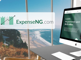
Expense NG
An online coworking community for indie hackers, entreprenuers, and founders. Chat live with app developers, designers, and mentors. Access video courses and tutorials.

View Case Study
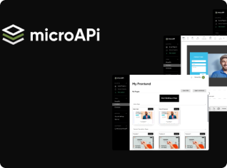
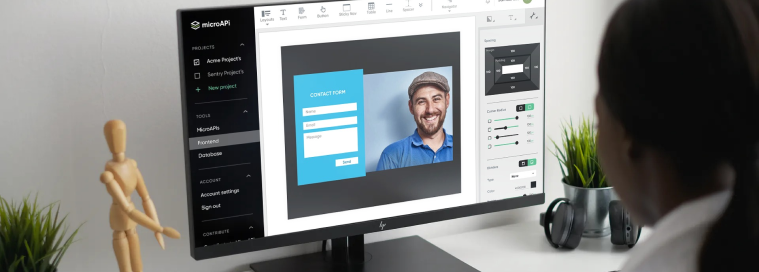
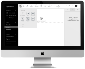
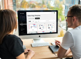
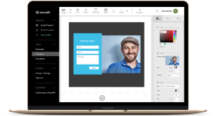
Micro API (Frontend Builder)
An online coworking community for indie hackers, entreprenuers, and founders. Chat live with app developers, designers, and mentors. Access video courses and tutorials.
View Case Study
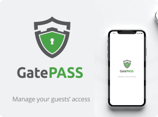
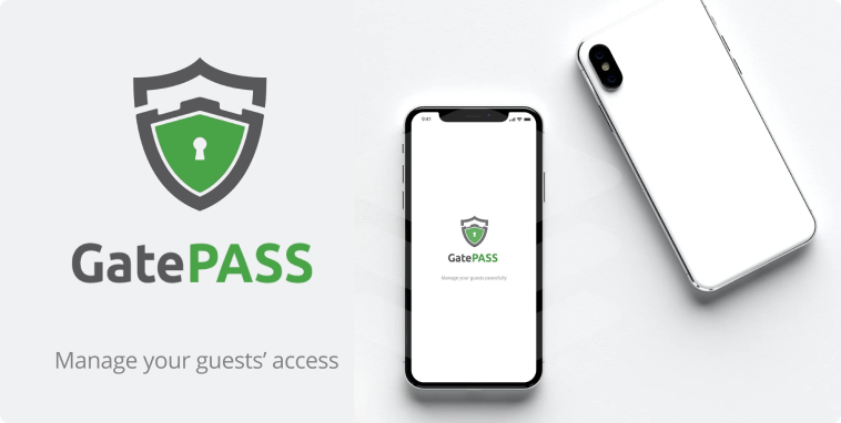
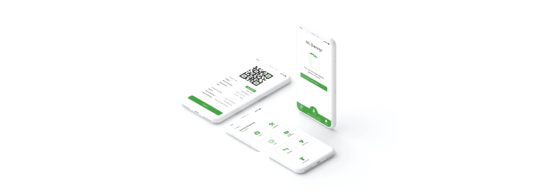
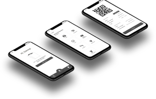
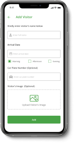
GatePass App
An online coworking community for indie hackers, entreprenuers, and founders. Chat live with app developers, designers, and mentors. Access video courses and tutorials.
View Case Study
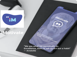
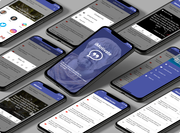
iMotivate
iMotivate is a daily motivational app that feeds you with daily quotes from popular people. With the app, you can save the quotes on your phone or even share with your friends.
View Case Study
projects

About the project
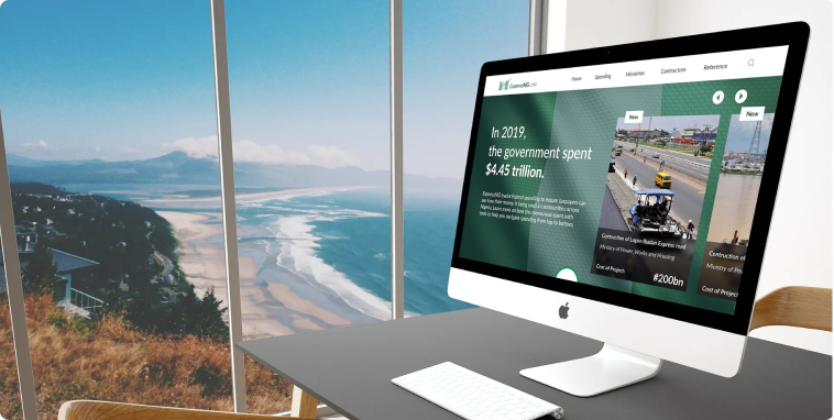
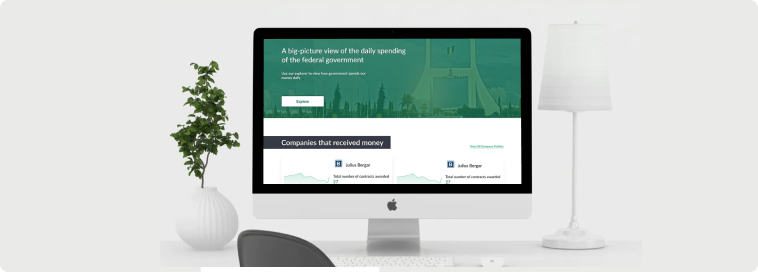
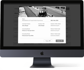
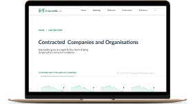
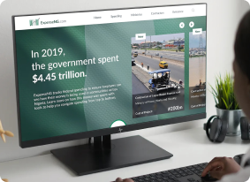
So this product was borne from the concerns of the citizezns of Nigeria on how the government spends public funds. Most of the transactions done by the government are done behind closed doors and very few people know about it. The only channel to know this expenditure is a very confusing website that seems to be designed to stress you into giving up your search. So we at expenseNG decided to create a platform that simplifies the government daily expenses and also tweets its findings for better coverage and more publicity of the expenditures. This product is created for the public and masses who are intrested in the expenditure of the government and we expect that this should be every citizen of the nation. Our goal is to use this platform to reduce corruption because we believe that whern theres light very fewer evil can be done. The more informed the masses the mpre they can channel their frustration to the right source.
In this project i was the LEAD DESIGNER and I worked with a group of developers and designers who helped bring this product into reality.
Wireframing
At the beginning of our visual design process, we created wireframes for testing purposes. This was very important because it helped us focus on the user journey and easily iterate the design a couple of times without having to worry about colors and images. It's also quite easy to transit from low fidelity to high fidelity when an agreed structure is already available. We were a remote team so we used Figma for our Mockups and Prototyping because of its collaboration feature and mostly because we love using the tool. These wireframes were used for alpha testing to have a feel of the entire walk-through experience after 4 iterations we finally concluded on a structure.
User Testing
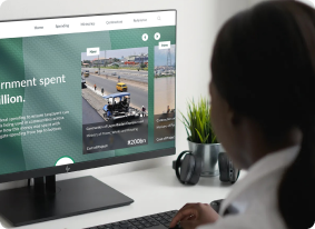
Before the lanching of the product, I did several testing rounds both alpha and beta testing, in order to reveal possible usability problems. First of all I wanted to be sure we were not delivernig an information overload to the users. I wanted to focus on the most important information so that we do not repeat what was done in the government’s site. I also wanted to test if the infographics I used were understandable by the layman. Don’t want to be the only one that gets my design. These testing actually led to reitration of the site and total revamp of my initial design uhh!!. But it was worth it. Whtas the use of designing someting that’s meant for the public if they woudn’t use it.
Colours And Typography
#33A97E
#1F2430
#CC0010
#005D3B
#474747
Lato
H1 - 36px H2 - 28pxH3 - 20pxBody - 18px
UI Design
Once we tested out all usability mistakes, we started designing the final screens in Figma. We decided to go with the light visual style and also in the future incorporate the dark mode. We were inspired by the KISS rule because it was important to us that our users have good clarity about what they want to achieve with this application in the quickest time possible. We designed the site in such a way that it can be integrated for use in both all webrowsers and screen sizes including mobile devices. Most of our users would want to easily add visitors to the expect list or add some visitors to the banned list without compromising the details required for security which makes me particularly thrilled about the simplicity of the application and how easy it is to navigate through it.
My Conclusion
Making a differene in a country like mine is quite phenomenom and ‘m actually particulally proud to be a part of this project. And i can’t wait for it to begin to have its full impact on the masses. I was really excited about this project when i first got it and I still am. I really want to make a diffrence and if i do it thorugh design I’d do it over and over again.
Figma link: https://www.figma.com/file/
MYsGV8NXtefVNUkrvdAhQX/ExpenseNG-Official.
4
Iterations
34
Pages
17
Coffee
projects
About the project
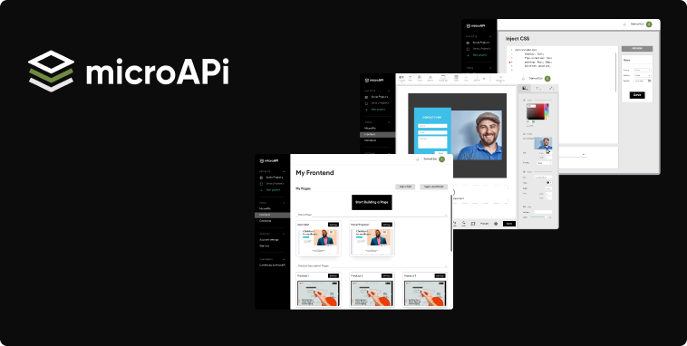
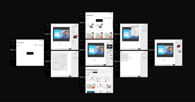
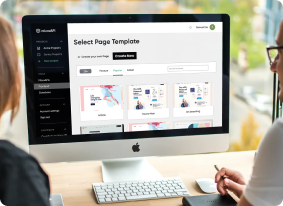
MicroAPI is a platform designed to help web developers in creating products and
websites without
neccessarily having to code. It serves as a platform for users to get all the
rescources needed
for web creation. My design task was focused on building a web app for frontend
building. So the
MicroAPI Frontend Builder as its called is supposed to help users design a fully
working
frontend of their site using preset templates and HTML/CSS components. This app is
geared
towards helping the layman to build a website of his own without having to go
through the rigous
of coding it himselt or outscourcing it. I designed it to make it simple to use and
understand.
The app would need little or no training at all. In the app, I also integrated a
section for
advanced users that may want to inject their own codessuch as custom styling and
JavaScript
functions that would be exclusively available to them, or could be published and
added as a
contribution in the microAPI paltform.
I functioned in the role of a section lead, in which led the frontend builder
section .
Wireframing
At the beginning of our visual design process, we created wireframes for testing purposes. This was very important because it helped us focus on the user journey and easily iterate the design a couple of times without having to worry about colors and images. It's also quite easy to transit from low fidelity to high fidelity when an agreed structure is already available. We were a remote team so we used Figma for our Mockups and Prototyping because of its collaboration feature and mostly because we love using the tool. These wireframes were used for alpha testing to have a feel of the entire walk-through experience after 4 iterations we finally concluded on a structure.
User Testing
Before the lanching of the product, I did several testing rounds both alpha and beta testing, in order to reveal possible usability problems. First of all I wanted to be sure we were not delivernig an information overload to the users. I wanted to focus on the most important information so that we do not repeat what was done in the government’s site. I also wanted to test if the infographics I used were understandable by the layman. Don’t want to be the only one that gets my design. These testing actually led to reitration of the site and total revamp of my initial design uhh!!. But it was worth it. Whtas the use of designing someting that’s meant for the public if they woudn’t use it.
Colours And Typography
#000000
#EAEAEA
#D7D7D7
#6E8B41
#747C83
Gilroy
H1 - 36px H2 - 20pxH3 - 18pxBody - 16px
UI Design
Once we tested out all usability mistakes, we started designing the final screens in Figma. We decided to go with the light visual style and also in the future incorporate the dark mode. We were inspired by the KISS rule because it was important to us that our users have good clarity about what they want to achieve with this application in the quickest time possible. We designed the site in such a way that it can be integrated for use in both all webrowsers and screen sizes including mobile devices. Most of our users would want to easily add visitors to the expect list or add some visitors to the banned list without compromising the details required for security which makes me particularly thrilled about the simplicity of the application and how easy it is to navigate through it.
My Conclusion
This project up to this moment, has been my most challenging work. To me it was more like designinig an app that designers wold use in designing desings. And I think that was a challenge worth taking. This project project also opened my eyes to the posibility of other design areas that i can specialise in, like software design vehicle design, drone designs etc. After this project I think I’m open to any form of designs as long as it is solving a problem. I’m particularly proud of this project because it’s a first of its kind for me and the beginig of many more projects like it in the later future.
4
Iterations
34
Pages
17
Coffee
projects
How it all started!
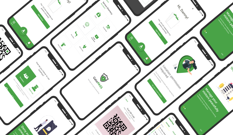
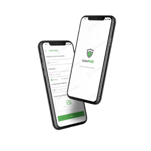
The story of this project begins with the HNG 6.0 internship. The HNG internship brings thousands of learners around the world under one community to collaborate and procure solutions that can solve real-life problems. While I was in the design track and at stage 4, we were asked to provide a solution for communities. Apparently we were divided into two teams of designers and my team decided to design a gate pass solution for gatted communities. Well, we called it GatePass. lol. The solution was targeted at those people living in gated communities and the gatemen for proper management of visitors and community security. Before the design of this app, residents would have problems with visitors' access to the communities and may have to sometimes go to the gate to identify their visitors. Even sometimes unwanted visitors may be given access to the estate. This application also improves the security management of the communities. I was one of the designers among a couple of other designers who were given this task to brainstorm and design this solution.
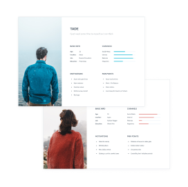
Personas
Based on the interviews/workshop we set up two personas Tade and Wunmi. We referred to them throughout the entire product development process. My team decided that we would want our product to be human-centered and also human-centered. In this light, we decided to create two very different personas; one that loves his quiet and one that would prefer more guests around. We used the data gathered from the interviews to create these personas. From the interviews, we were informed of the channels used for social interaction by users, their motivations and their major pain points. We also got the idea that there were certain visitors that some residents would not want at all in their homes so we added the banned list feature where residents can input people they don't want to see. The personas were reflected on through-out the design so that the app would be convenient for everyone irrespective of who you are.
Wireframing
At the beginning of our visual design process, we created wireframes for testing purposes. This was very important because it helped us focus on the user journey and easily iterate the design a couple of times without having to worry about colors and images. It's also quite easy to transit from low fidelity to high fidelity when an agreed structure is already available. We were a remote team so we used Figma for our Mockups and Prototyping because of its collaboration feature and mostly because we love using the tool. These wireframes were used for alpha testing to have a feel of the entire walk-through experience after 4 iterations we finally concluded on a structure.
Colours And Typography
#49A347
#202020
#CC0010
#C4C4C4
#464646
Open Sans
H1 - 36px H2 - 20pxH3 - 18pxBody - 16px
UI Design
Once we tested out all usability mistakes, we started designing the final screens in Figma. We decided to go with the light visual style and also in the future incorporate the dark mode. We were inspired by the KISS rule because it was important to us that our users have good clarity about what they want to achieve with this application in the quickest time possible. We designed the site in such a way that it can be integrated for use in both all webrowsers and screen sizes including mobile devices. Most of our users would want to easily add visitors to the expect list or add some visitors to the banned list without compromising the details required for security which makes me particularly thrilled about the simplicity of the application and how easy it is to navigate through it.
What I learned from this project.
Sincerely, I was first of all skeptical about the way this project would turn out because of the number of designers on the team and the fact that it was remote. Though we struggled a bit in the beginning, we were determined to make this work thanks to Figma's collaboration feature it was easy to share ideas and make iterations.
I learned a lot about remote collaboration in this project and I have now acquired a great measure of possibility mentality when it comes to remote-collaboration.
Our design was chosen as the winning design and my team won the competition.
Figma link: https://www.figma.com/file/
8d9Km2JAuWTwmHSuL1Zjjq/Gatepass?node-id=0%3A1.
4
Iterations
34
Pages
17
Coffee
projects
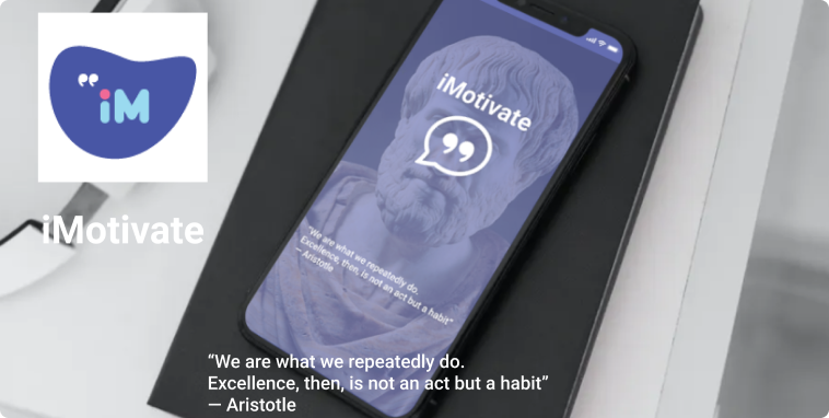
About
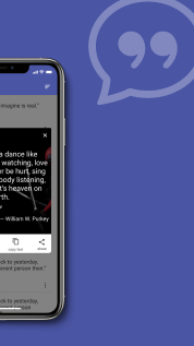
iMotivate offers you a large collection of motivational quotes to keep you going. Our collection of quotes can serve as a great caption for your latest post on WhatsApp or Instagram, it could also help you get that viral tweet on Twitter. If you need something to keep that fire burning then iMotivate could be your fuel with motivational quotes from great men and women.
Colours And Typography
#4A55A4
#373737
#FFFFFF
Roboto
H1 - 36px H2 - 20pxH3 - 18pxBody - 16px
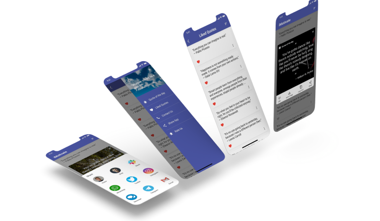
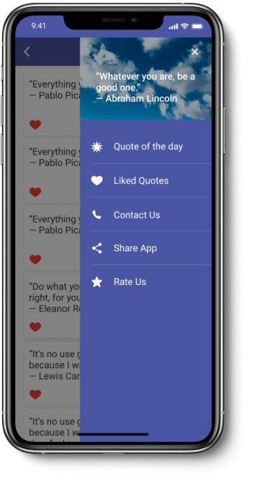
Features
- Daily motivational quotes update.
- Share quotes to your favourite social media app.
- Download quotes and save as an image in your photo gallery.
- Allows you to copy quotes and use them wherever you want.
Contact me
josh.abolade@gmail.com
linkedin.com/in/joshua-abolade-42b35b132
twitter.com/ joshabolade